


- October 02nd, 2013
- /
- Block Style, Blue, Brown & Bronze, Caligraphy, Design Tips, Do-it-yourself Invitations, Fonts, Fun & Funky, Gold, Layered Card, Modern, Pink, Planning your Invitations, Pocketfold®, Purple & Lavender, Rustic/Western/Country, Silver & Gray, Turquoise, Vintage, Wedding Invitations
- /
- 0 Comments
- /
- Invitation Design That Sets the Mood for YOUR Wedding

Your invitation is one of the first things your guests will see to introduce them to your wedding. Invitations not only convey the time, date, and place, but also give guests some clues about the theme, formality, and mood of the event. In this article, we will explore how different fonts and layouts totally change the look of an invitation – bringing out your personality, and set the stage for your fantastic event. Any of these styles could be incorporated into a pocketfold, pocket card, or other enclosure, or be lovely as a layered or stand-alone card. At the end of the article are links for the items used in these examples.
We’ve taken one invitation in this example – same wording, same venue, etc. Using different fonts, colors, and layout styles, we can totally change how the event is presented based on the design:
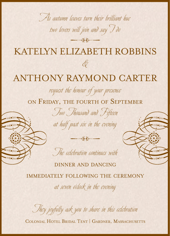
Invitation Style #1: The Very Traditional, Ultra-Formal Affair

This font features the gorgeous Burgues script font paired with Serlio block font, and a simple but elegant embellishment/divider, all printed on a creamy matte Classic Ecru stock with gold ink and a Champagnium (gold) backing layer or pocket card to create a frame. The body of the font is blocked (not just centered).
Invitation Style #2: Elegant Styling with Victorian Elements
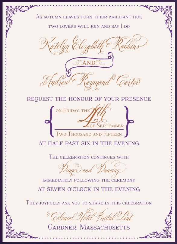
This invitation features ornate corners, a hand-styled script font – Belluccia – with the block font, Foglighten. The “and” in the scroll along with some graphical treatments of the date help this invitation create a uniquely vintage feel. The invitation is printed on matte Classic Ecru and layered on a matte Amethyst (eggplant purple) pocketfold.
Invitation Style #3: Patterns & Backgrounds
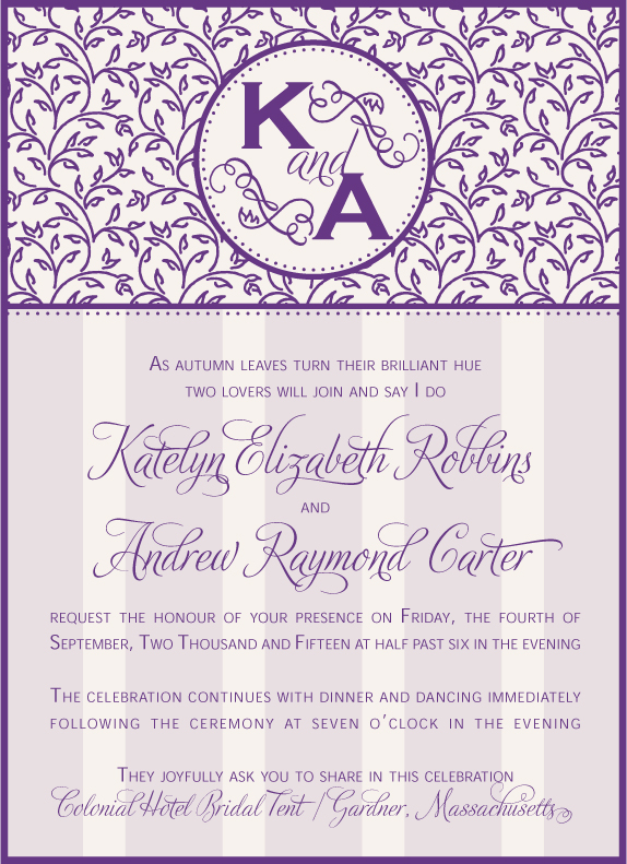
This invitation features fonts that are just little less formal – but still gorgeous – Adios script font paired with Geometric 415. Graphical elements feature a leaf pattern across the top and subtle stripes behind the text. Centered in the bold leaf pattern is a monogrammed circle. This combination of backgrounds and patterns brings a bit more of an “arts-and-crafts” feel to the invitation. The invitation is printed on PC100 Ecru (recycled matte) and layered on a metallic Majestic (royal purple) pocketfold.
Invitation Style #4: Calligraphy

Layered on top of our gorgeous colored pattern cardstock – Fiore, and a second border of Dragonfly cardstock, this calligraphy style invitation is all in script with plenty of scrolls and swoops. This is the same script font as used in invitation style #1, Burgues, but because the wording is printed at an angle, the invitation has more of a hand-written feel.
Invitation Style #5: Western/Country/Rustic
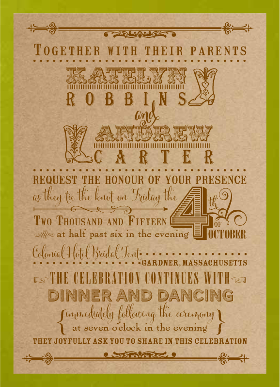
This time, printed on our matte Cork cardstock with a bright green metallic Napa backing layer, this rustic style includes a variety of distinctive fonts – some distressed – and some decorative lines and elements that bring out the country feel. This is almost exactly the same wording as the invitations shown above, but gives quite a different feel because of the font treatment and layout.
Invitation Style #6: Modern Block
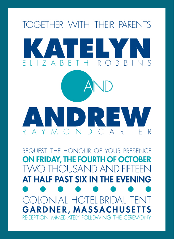
This teal and navy invitation features block-style fonts, laid out in a block (no jagged edges!) along with some circle elements to keep with the geometric styling. This font features Futura font in black, regular and light faces to create variation. The strong borders on the bright Classic White cardstock layered on the Dragonfly backing gives a very crisp and clean look.
Invitation Style 7: Formal & Funky

This coral and gray invitation utilizes a formal layout style, but features some fonts with a distinct personality. The script font, Carolyna Pro – with lots of options for feminine swoops and swashes, is paired with the block font Tall, Dark & Handsome, to create a balance between feminine and masculine. This invitation shows a metallic white stock (White Micah), layered on Peony (coral) matte cardstock, in a Turtle Dove (gray) matte cardstock pocketfold.
Invitation Style 8: Reversed Script
In this invitation, we have reversed the body copy to be in script, and the names (along with some other lines) in the block font. This is still a very formal look, but especially when paired with the formal flourishes and dividers, a strong presence is created. This invitation features Mrs. Eaves as the block font and Avalon as the script font, printed on a creamy peach metallic cardstock (Cameo) and layered on a matte Cocoa pocketfold.
Whether we are designing and professionally printing your invitation suite for you or you are designing and printing on your own, we hope this gives you some ideas on how the fonts you choose can impact the mood and style of your invitation. There are so MANY options! If you are designing your invitation on your own, be sure to take a look at all the blank cardstock and enclosures we offer in over 200 colors and patterns, as well as a list of many fabulous fonts. And of course, if you want us to design your custom invitation suite, we can create whatever you have in mind.
Note: all images in this article © EnvelopMe.com
You might also be interested in:
How to order Printed Invitations