- February 25th, 2011
- /
- Embellished, Invitation Inspiration, Ivory, Motif & Theme Events, Pocketfold®, Purple & Lavender, Traditional, Wedding Invitations
- /
- 0 Comments
- /
- Friday Feature – A “Royal” Affair
By Tayva Bloomer
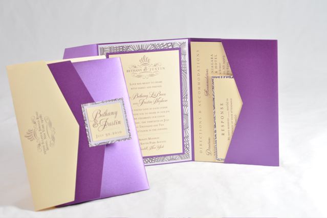
For the first “Friday Feature” article, I wanted to spotlight an invitation that was created for LeAnn. LeAnn has ordered from us on various occasions and wanted to design something special for a close relative’s summer wedding in New York. The result? See for yourself…
3 Things I Love:
1. Color
In recent years, purple has been one of the hottest colors in all design industries. From jewel tones like Majestic and Amethyst, to soft pastels such as Lavelite and Ametrine, and classic shades like Imperial and Orchid, Envelopments cardstock provides our customers with many options to incorporate purple into an invitation ensemble. Depending on your preference and personal style, it can successfully set the tone for a wedding in any season.
For this invitation, LeAnn chose to work with C3 Jester and C2 Lavelite, as well as one of our Kaleidoscope patterns (C4 Luster-KAL25). Although it may not initially look it, Jester is a specialty cardstock with a smooth, almost vinyl-like feel to it. I love that she chose this for her Pocketfold, because the slight use of texture adds a touch of chicness that makes it fancy but fun all at once! The bright color really makes everything else pop – perfect for a summer wedding. She then chose to use C2 Creme Brulee as her printing stock – which may very well be my favorite part about this invitation. Creme Brulee adds warmth to an otherwise cool color palette, and creates a color scheme that is both unique and visually-pleasing.
2. Typography
Typography is one of the most important invitation elements that is all-too-often overlooked. Whether you opt to use thermography or flat ink, cursive or print – not only does this determine the readability (very important!) – the font can ultimately convey a message to your guests about the style of your wedding festivities. (Casual or Black-Tie? A small backyard gathering or an intimate evening affair?)
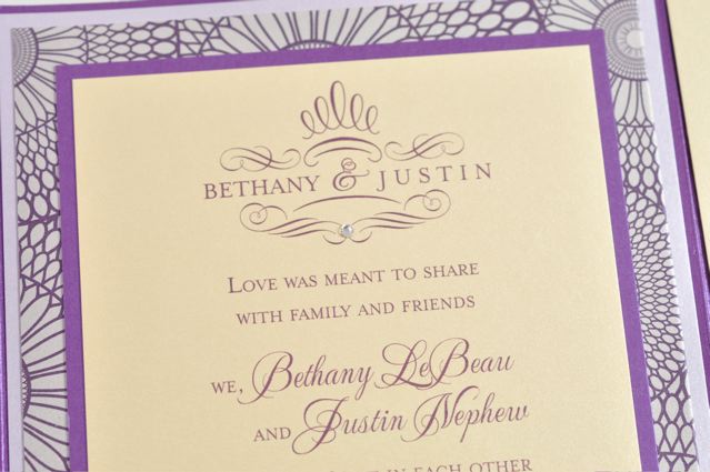
In this invitation, a cursive font was used to highlight the names of the bride and groom, as well as other headings on the enclosure cards. Everything else was in a small-caps print. The use of flourishes creates an elegant heading while corresponding with the names of the couples below, so that they remain the focus. The swirl artwork also allows the option to add some bling to the invitation, without looking overdone. LeAnn chose to print in thermography, which adds the perfect finishing touch.
3. Assembly
Lastly, the complete assembly of an invitation simply combines all design elements into one to become the finished product.
Some things that are of note in LeAnn’s are her custom cut backing layers, repetition of color (additional Jester backing to highlight the pocketfold, backing layers from the main invitation reappearing behind the seal in an opposite arrangement), and adding a small patterned layer behind the RSVP card; something that is not often done but looks fabulous! Everything was sealed inside of a Creme Brulee envelope, echoing the printed stock to be found inside.
Click here for the complete recipe of this invitation.
My Overall Impression:
A beautiful, tastefully-done invitation that has an air of refinement and fun due to all elements. Personal touches create a totally unique, one-of-a-kind ensemble that is timeless. My all-time favorite 🙂


