- Destination: Paradise
By Jeanie Thatcher
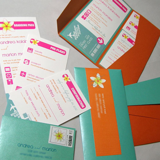
Imagine opening the mailbox and seeing a stack of white envelopes that your mind automatically assumes are bills, but amongst the sea of white you spot a bright blue and orange envelope. Which envelope would you open first? Of course this envelope would not be tossed on the table to sort through later. It would be opened immediately! And as it is opened, the excitement would increase more and more as each wonderful, colorful piece is found.

3 Things I love:
1. Color
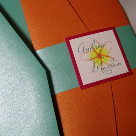
As I stated before, the exciting color scheme starts with the envelope and the icing. The orange provides a great contrast when paired with the blue and immediately attracts the eye in to find more. When the envelope is opened, there is a repeating color scheme with the Tangelo pocketfold and the Caspian bandwrap. The seal also repeats the tropical flower [artwork supplied by customer] that was seen on the icing as well. A Fashionista backing layer for the seal helps capture the pink outline of the flower and tie the three colors together.

The orange/blue/pink color scheme then continues with the printed invitation. The main ink color used is pink, which is a good contrast from the little pink used on the outside of the pocketfold. Blue and orange inks are also used sparingly.
By combining C3 Tangelo, C2 Caspian, and a touch of C3 Fashionista, this is the perfect invitation for a destination beach wedding!
2. Typography
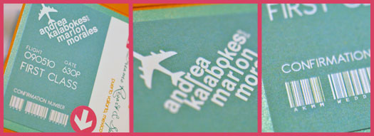
May I start with my favorite tiny detail that most guests probably never noticed. If you look closely at the barcode on the bottom right (may not be able to see in the picture) the letters and numbers under the code spell out “AKMM WEDDING 090510”. The same barcode is then repeated on the bottom of every insert.
This very small detail is a great addition to the whole invitation and gives it a realistic boarding pass look.

Adding the the boarding pass to the wedding, the “flight number” is the date of the wedding and the gate is the time of the ceremony. Centered above the flight number and gate number is the “airline logo”, aka the bride and groom’s names which are tied to each other by certain letters. For instance, the “r” in “andrea” and the “l” in “kalabokes” run into each other as they were meant to be one – giving it a “corporate logo” look.
Of course, I cannot forget the icons that are used as bullet points. This simple touch of coordinating icons is another favorite of mine. It gives the viewer an easy idea of what the text will say. The icons portray exactly what the paired text will say.
3. Assembly
The 4 x 9 Landscape Pocketfold is used for this invitation but is used in portrait orientation. I love when landscape pocketfolds are used for portrait invitations so the pocket is on the right and stands up with the inserts as well. Though you cannot see the titles of the inserts when in the pocket, there is a repetition of the tropical flower throughout and they are lined up perfectly, peeking out of the pocket. To close the invitation, a bandwrap that matches the inside backing layer (C2 Caspian) is used and closed with a seal.
Click here for the complete recipe for this invitation.
Overall Impression:
This is a bright and fun wedding invitation that uses the pink, orange and blue color scheme perfectly. The small and simple details pull the whole invitation together and allow the couple to give their guests a beautiful ticket to paradise! I would definitely travel to this wedding to be able to see what else is in store because with an invitation this amazing, the wedding is surely to be equally as magnificent!


