- Friday Feature: SUMMER FUN
by Paula Smith
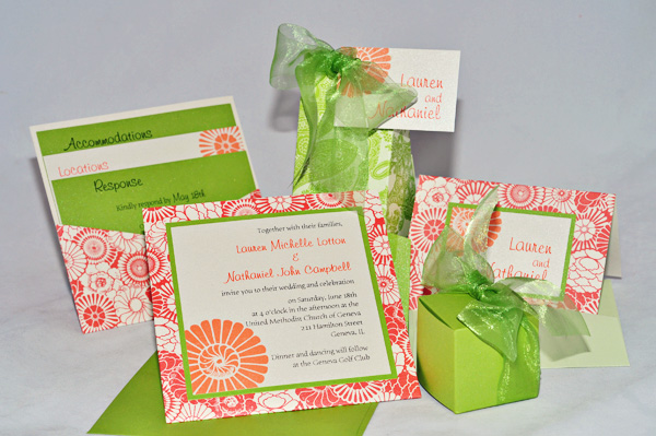
With it’s vibrant blooms and effervescent color scheme, Lauren and Nathaniel did a wonderful job incorporating “Summer Fun” into their wedding invitation design. What a great use of pattern and color to achieve a colorful, bright, and definitely FUN invitation!
3 Things I Love:
Color
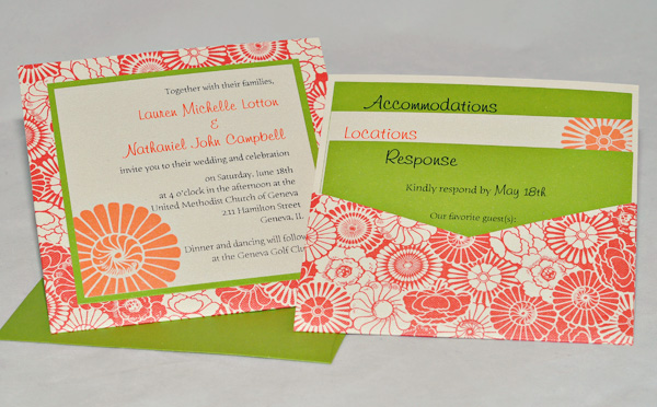
For the base 5 x 5 Pocket Card, Lauren and Nathaniel choose a striking Bloom pattern called C4 Magnolia-BLO17. They paired it with our metallic electric green C2 Wicked, as the backing layer, and also replicated this bright green in two of their printed insert cards and as well as the mailing envelopes.
The Pocket Card – which is a single, nonfolding enclosure with a flat side on the front for the invitation and a pocket for enclosures on the back – is a great way to present an invitation, especially when the Pocket Card features a patterned cardstock.
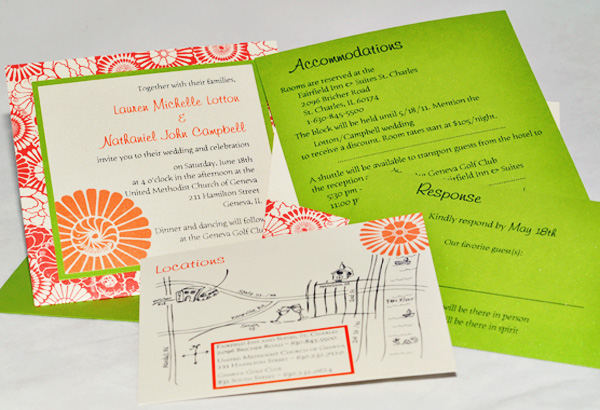
The actual invitation, as well as one insert card and the gift tags/thank you seals are printed on C2 Metallic Ecru Micah with bright Mango ink. When the insert cards are stacked in the pocket, the choice of cardstocks really make the invitation. What a fun play of colors with Orange, Green and Cream. It almost asks you to enjoy an evening at the park!
Typography
I love, love, love the use of artwork on an invitation; it is a great way to make the invitation truly yours. This one did it perfectly! The motif used is a flower taken out of the Bloom pattern which is artfully paired with the lighthearted and inviting font selections to gracefully lead guests through all of the wedding information. Headers, complementary fonts, and alternating ink/paper colors bring everything together in an organized but delightful fashion.
A quick word about ink colors: One great way to highlight your design and color scheme is to use two colors of ink. This invitation is a perfect example of how the names and art work jump off the page by using the Mango ink while all the wording is in black. Everything was printed in thermography (raised ink) to bring this invitation to a new level of casual elegance.
Details
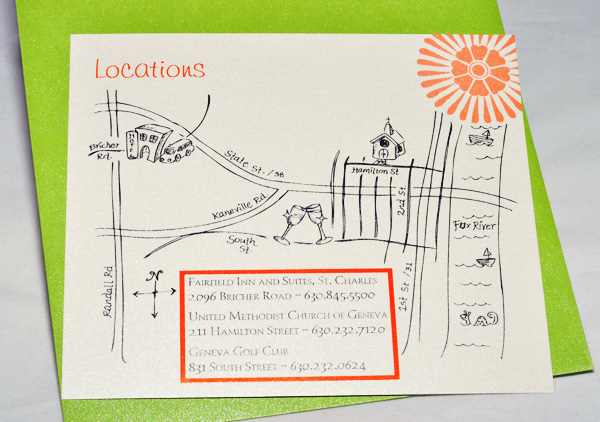
One of my favorite details of the whole invitation is the hand-drawn map. The bride drew her own map – which makes this invitation so much more personal – and she incorporated little details, such as the fox head design on the “o” in the name “Fox River” and the Sea Monster (like those on old-time ocean maps) in the river. So cute! (Tip: If you are not an artist, don’t despair… we can computer-draw a custom map for you.)
Don’t forget the extras…
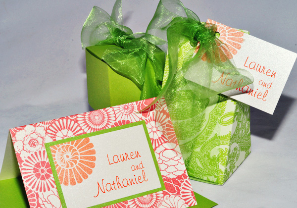
You can print your own tags to use as Favor Tags or as monogram seals for layered Thank You cards. Or, if we’re doing the printing for you, just let us know you need these, and we’ll price it into your invitation quote for you. You can punch a hole and tie to a ribbon around your matching favor boxes for a lovely favor tag. And for easy thank you cards, just order the corresponding 3.5 x 5 folded cards (shown – or 4 x 5 size if you prefer a larger card) along with envelopes and backing layers needed for your design. The tags shown here are 2 x 3″, with a 2.25 x 3.25″ backing in C2 Metallic Wicked. The Favor boxes shown are the Pyramid in C4 Serpentine REG83 and the Bon Bon in C2 Wicked, with Sheer Midori “Green Apple” ribbon (the ribbon is not yet on our site, but we can order this for you).
Overall Impression
I love the “summer fun” this invitation represents. It creates a joyful, refreshing impression through the choice of colors, pattern/art work and a great creative way of putting it all together!
Resources used in this invitation:
Click here to order blank stock to make your own invitations (5 x 5 Pocket Fold – C4 Magnolia BLO17, 5 x 5 Cardstock custom-cut to 4.75 x 4.75 for backing layer #1 – C2 Wicked, and the printed pieces are C3 Magnolia custom-cut to exactly 4.5 x 4.5 for the main invitation and 5.5 x 4.75 for the Locations card. The Accommodations card is printed on C2 Wicked custom-cut to 5.5 x 5.5 and Response card (also C2 Wicked) is the standard 3.5 x 5 cardstock. Outer Envelopes (5 x 5) in Wicked, with optional Magnolia Envelope Icing. Remember, we can also design, print and assemble these for you. Click here to contact us about a custom quote.
*Consider using a C1 matte stock, such as C1 Classic Ecru and C1 Green Tea, if using an ink jet printer to print, instead of the metallic stocks shown above. If printing close to the edge or running your design off the edge as shown in this example, be sure to start with a larger piece and cut down after printing.
Click here or our article about Envelope Icing (lovely labels for your envelopes that you can print yourself)
ARTWORK: The flower images shown here are only available on invitations printed through an authorized Envelopments dealer. Click here for searchable clipart you can purchase for your own DIY Invitations
FONTS: Click here to purchase these fonts to use on your own invitations: Freehand 591 (used for fancier names/titles and used for monogram) and Humana Serif (straight font), both from MyFonts.com, or just search for the right font for you!
Don’t forget the custom stamps: order Custom Envelopments Postage to match our stocks or Create Your Own. If we design your invitations, we can also design a matching stamp for you.


